Charging Visual Concept

BMW Designworks

UIUX Concept of the BMW EV Charging Station

Role

UIUX  Design

Brief

I supported the interaction design team of BMW Designworks Munich Studio in their new charging project. After the industrail design team designed the award-winning charging station for BMW Welt, I was given the opportunity to imagine the user experience and visual concept of the payment and charging screens.

Background

Requirements

The “Future of Charging” project initially concluded with the industrial design of the charging station, the project transitioned into the digital phase. My role was to develop the UI/UX concepts for the charging screen.

Through studying existing products and our supplier's, I noticed the experiences rely on technical steps and lack expressive visual communication. This became the foundation for my goal that is highly legible outdoors, easy to understand at a glance, and visually consistent with the futuristic and energetic identity of the charging station itself.

Charging States

I approached this design with a focus on efficiency and operational clarity(you see from a distance). Public charging today is often fragmented, so I aimed to create a flow that reduces friction and supports confident use to meet the future. I designed an experience that minimizes unnecessary interactions and makes the entire charging process faster, clearer, and more intuitive.

User Steps

Overview

I approached this design with a focus on efficiency and operational clarity. Public charging today is often fragmented, so I aimed to create a flow that reduces friction and supports confident use to meet the future. I designed an experience that minimizes unnecessary interactions and makes the entire charging process faster, clearer, and more intuitive.

1. Payment UX

For the Payment UX, I designed the interface with the realities of kiosk usage in mind. Outdoor charging often under time pressure, I intentionally used larger typography and illustrations to make the information easy to read and understand at a glance.

In terms of flow, I prioritized efficiency: most users naturally plug in first and expect the system to “just start charging.” The experience automatically skips both the start and plug-in screens, moving directly into payment when possible. This reduces unnecessary steps and aligns the interface with how people actually interact with public chargers.

2. Charging UX

For the Charging UX, my focus was on visibility. Users rarely stay beside the charger for the full session, so the interface needed to communicate progress at a distance. I designed the charging state with a growing blue area and a large, centrally placed percentage to maximize glanceability and make progress easy to detect even from far away. The color selection follows the same principle and being noticeable to both the user and passersby.

Visual Development

Visual References

I started the project by exploring multiple visual systems through a reference board, searching for ways to represent the abstract concept of energy flow. Because it has no fixed form, every direction suggested a different mood and pace. The challenge was to define a visual language that captures this sense of motion without losing clarity or purpose.

Motion Development

In the early stage, this direction might have seemed almost too obvious — just one of many explorations. But when I looked at them together, the glow of blurred light and deep blue started to feel right. It carried a quiet sense of movement, like energy shifting from the tree. That softness and brightness became the most intuitive way to express an “energy transition” — something undefined in the brand.

Design Iterations

Through each iteration and interface test, I gradually confirmed that the glowing effect should become the core visual element of the system. By simplifying on-screen information, I aimed to make the experience efficient and effortless — fitting for a small display that users only interact with briefly in real-life situations.

Across several rounds of iterations, I tested how light should move in static interface, how bright it should feel, and how much information the user really needs. Each version taught me something — sometimes to add, more often to take away. The process became about finding that thin line between emotion and clarity, until the interface finally felt calm, glowing, and alive.

Interpretation of "Energy Transmission"

I began by creating a series of abstract illustrations in Figma, experimenting with blur, gradients, and light to imagine how energy might move through the system. Some visuals pulsed gently from the center, while others streamed from left to right like current flowing into the vehicle. I explored how each motion could express a different emotion — static calmness for the homepage, and dynamic, kinetic movement for the charging state. Through this process, I started to shape how “energy” could look and feel in a digital form.

Initial Concept

"An Immature Idea"

This early exploration was created after defining the UX structure, and served as an initial attempt to visualize the charging states. At that stage, the direction lacked a strong visual core and did not yet form a cohesive system. The overall expression did not fully communicate the clarity and recognizability required for an outdoor charging kiosk.

After completing my internship, I revisited the project with a clearer understanding of visual hierarchy, brand consistency, and real-world legibility. This led to a complete upgrade of the visual language: simplifying the composition, strengthening the center-focused layout, and defining color transitions as the primary method of communicating charging progress. This iteration represents an important step in my own visual design maturity and unified visual system that enhances the UX rather than merely decorating it.

Takeaways + Insights

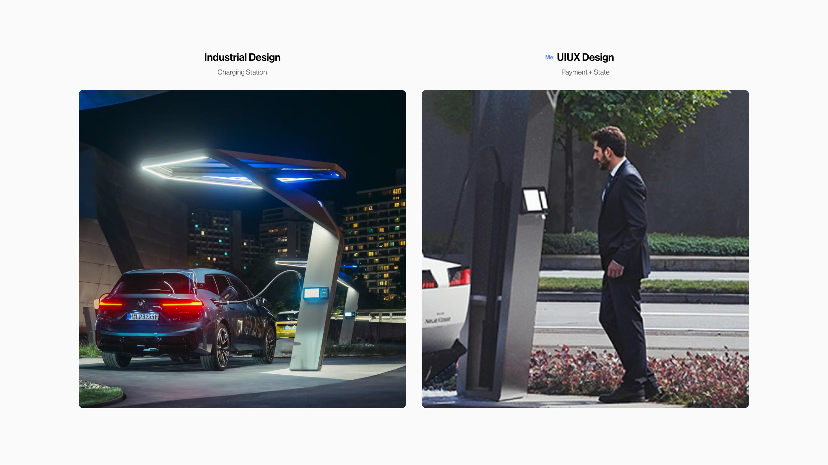
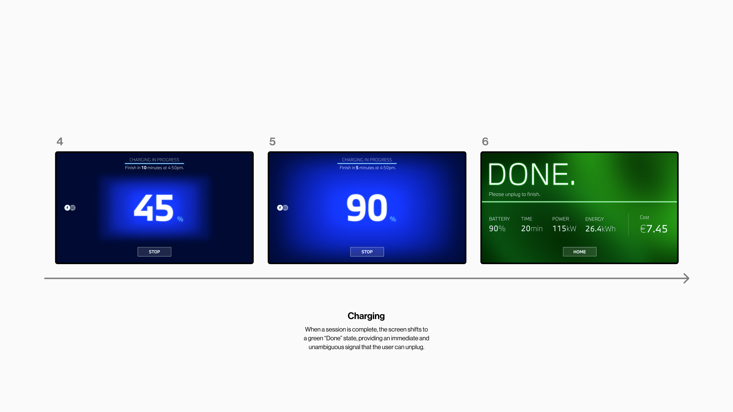
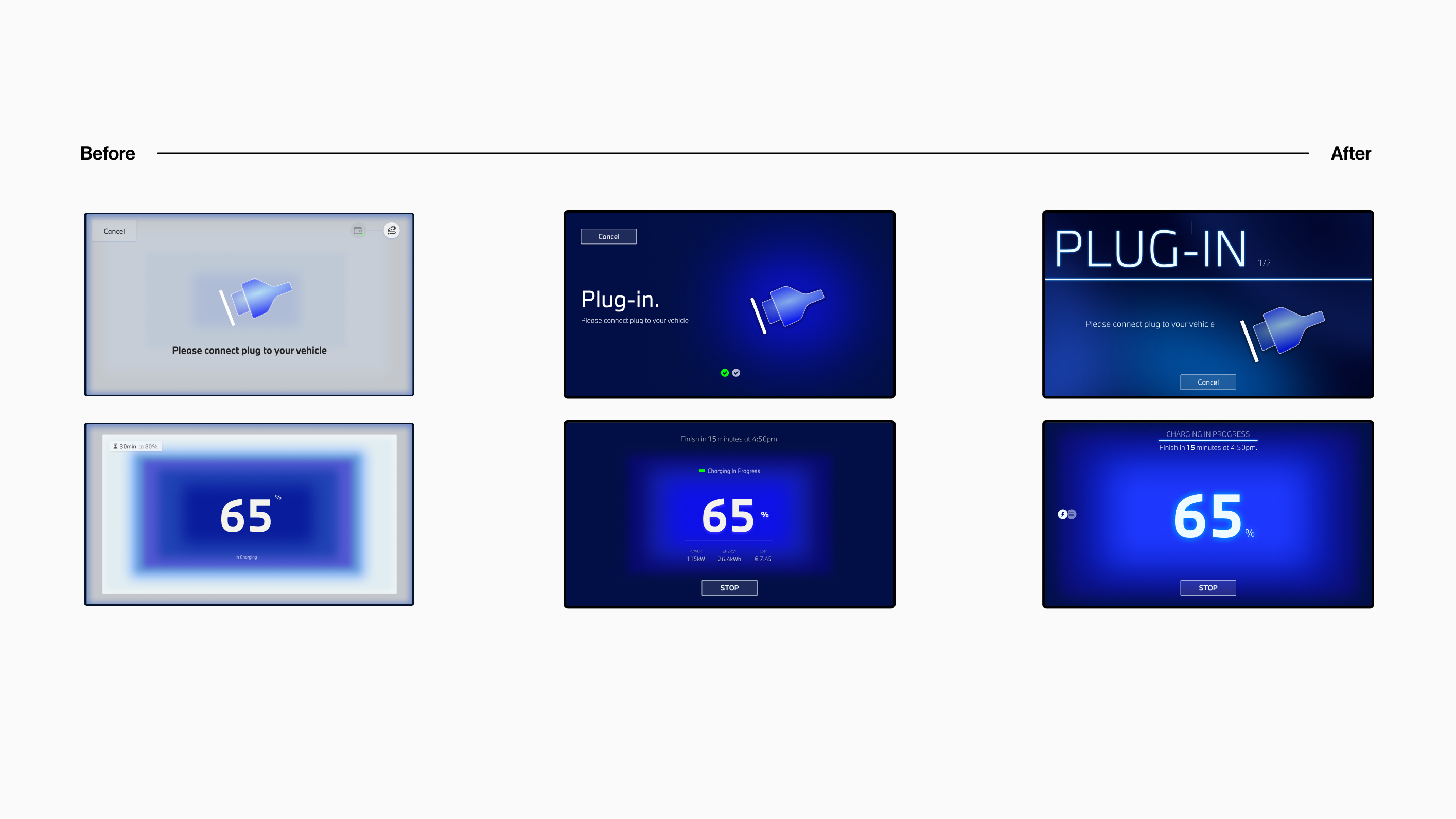
This project became a turning point in how I think about visual experience and abstraction. It pushed me to translate something invisible — the idea of energy flow — into a living interface. Through every iteration, I learned to balance aesthetic beauty with usability and purpose.

I’m deeply thankful to Julia Raith, our team lead, who guided me with patience and insight as a mentor. Her feedback helped me grow through every failure and find clarity in direction. And to Lenni, who first inspired me to visualize energy as movement — that spark shaped the heart of this project.

Team

IxD Lead:
Julia Raith

Lighting Design:
Lennart Baramsky

Industrial Design:
Tobias Adami / Junghoon Lee / Tim Winterhalter / etc.